This post is not about trends. There are lots of predicting blog posts elsewhere about that.
This post is a collection showing how some large/succesful sites have changed over time. Preferably it goes beyond the homepage and looks at details such as navigation structure also.
The idea is not to only learn how to design for now. You can open any website and see what’s hot now. It’s more about what we or the ‘big players’ have learned about what works and what doesn’t work. To understand the changes they made and why it’s an improvement over the previous. This knowledge saves us time as they (we assume) have done lots of A/B and usability testing for us and we can observe the changes.
(skip the last part about VMware marketing rant; insight into interface trends. Why are apps so much easier to use? Will desktop software look and feel more like apps in the near future?)
Overlays are an aggressive disruptive method of getting users attention. If abused or not implemented properly, visitors may leave the site. Especially on mobile, due to the limited screen size, there are better solutions. As usual it depends on the context and content. Highly recommend that you evaluate the need for a (mobile) overlay on a per-project/per-application basis.
Some applications that could be using overlay (but could be handled with an alternative):
Web survey
Can I help you chat function
Modal dialog message (if content is limited, say just one line of text and 2 buttons, then these are maybe the only exception for using mobile lightbox)
Image slideshow or video preview
Content preview (by clicking a ‘?’ or info-button)
Other
Alternative solutions:
Fixed-position button that scrolls along while the user moves down the page
Fixed-position button appearing at some point e.g. appears only after if the user has scrolled 1 pagelength down
Prominent content on the page (e.g. near the navigation header)
Navigate to new page, expand an accordion, slider/carrousel, swap content. (for lightbox overlays that appear after a user clicks something)
Modal dialog. Probably using the alert JS function (TBC if it’s feasible to add links and other rich content)
Other solutions
Some principles (if overlay is the only option):
The overlay should always be visible in the mobile viewport. It should never be the case that a user scrolls and only sees the overlay background.
The close button should always be visible. (must-have). This is often in the form of an X in the top-right and/or “Close” button, but can be a floating X or auto-hiding X as done in some Jquery plug-ins.
Overlay background should be visible so that user knows it’s an overlay that is part of the site.
Sometimes it needs to be clearly part of the site (e.g. branded or mentioning company/website name the title)
The overlay should be resized and the content scaled down (see some Jquery plug-ins for overlays/lightboxes)
It needs to be carefully tested on different devices/browsers. Zooming in and out of the conten should be possible, without hampering the possibility of closing the overlay.
Content should be limited on mobile. Scrolling can be problematic.
Generally it is not recommended to show an overlay after x seconds, especially if the user doesn’t expect it and didn’t click anything.
General behaviour
For regular overlays
Clicking outside the overlay will close it
Clicking on the X will close it (as is)
Pressing Escape key will close it (as is)
For modal overlays
Clicking on the Close label, image and/or button will close it
Examples and best practice
A reasonable example is the cookie lightbox of www.Hertz.com on mobile:
– Manage expectations. It seems to appear 1-2 seconds after the homepage is loaded, so the user still knows he’s on the right website and can still act on the cookie request. (dispite that lightbox may not be the best solution for cookie permission)
– Closing. There is a clear, branded “< back” button placed on the top of the overlay, making it quick and easy to close or ignore the message.
– Flexible. It takes up the full real-estate of the screen and if there’s a lot of content this is not a problem, it can be quite tall.
Conclusion
Because of the limited mobile screen size and the uasbility requirements listed here, content needs to be limited and overlays are often not ideal on mobile. Overlays that are limited in content and user-triggered may be an exception. In any case overlays must behave properly, as outlined in the principles above. I recommend to make a list of on what pages overlays are needed and approve the need for a (mobile) overlay on a per-project/per-application basis. If you have little control over this, offer guidelines (in the CMS or another form) to help the client realise the negative consequences of mobile overlays and offer suitable alternatives. Consider limiting the use of mobile overlays for the sake of conversion and the client’s own sake. Provide a overlay solution that can handle any type of (large) content and test it well.
When designing you generally have these layout options. Using any of these patterns often will have pros/cons and consequences on the flow and rest of the page design. Possible factors/pro-con considerations influencing your decision are:
real-estate (and fold)
visibility/prominence
suitability
loss of orientation
convention versus intuition
Vertical layouts
Verticaltabs
…
Cards
CON: Everything is shown expanded resulting in information overload and clutter.
PRO: No sub-navigation is needed
In this article I briefly discuss the possibilities of annotating your designs, with the option of quickly removing annotations when you don’t want to show them in your deliverable.
Let’s face it: Axure doesn’t have an quick and clean way to annotate your wireframes. This can be a pain when you are using your designs for different purposes:
1) you want an annotated version of your designs for functional documentation,
2) but you also want a clean non-annotated version.
Annotation is typically done with call-outs or “numbers in bubbles”.
In Axure the standard way to annotate your wireframes is using footnotes. Unfortunately these footnotes are very small and can’t easily be customised.
Option A – temporary delete/move
Unfortunately there is no quick and easy way to publish an Axure without your call-outs.
The best I can suggest is to temporarily delete or move the call-outs off the screen before publishing. Repeat this for every page you want to publish without call-outs.
with call-outs
without call-outs
Option B – dynamic panels
There isn’t the ease like layers in Photoshop. Axure does have dynamic panels. These work a bit like layers as you can quickly show/hide/move them, even in your clickable demo. But to edit a layer’s content you have to click around a lot (see demo http://screencast.com/t/mItXg1bqsg) switching back and forth between the annotation layer and the wireframe layer until the annotation is at the correct position.
If you go for the delete option, then you may also want to use the group feature of Axure. This way you can quickly select all call-outs at once (and then undo the change. Before you start, make sure to save your file as a different version, so that you don’t lose your original call-outs locations.
Option A or B?
I would go for either of these options, depending on the project. I usually just use custom annotations (option A) but then keep the call-outs in my click-demos. That’s because deleting them all just takes too much time. It might not be acceptable for all client presentation though.
Option C – footnotes
Other options like the built-in yellow Axure footnotes/annotations like this: are advanced but unfortunately not easy to maintain. They are also hard to read.
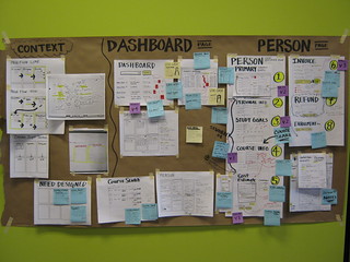
Sketchboards are popularised by Adaptive Path. Wireframes as a first step are too slow and detailed. The collaborative use of the sketchboard opens up the design process to everyone involved (all stakeholders including clients, visibility for management). Designers need a quick way to explore many different possibilities of the bigger picture, solo or in collaboration.
Related concepts
User flow –
Sketchboard – your starting point? “inspirational material such as personas or requirements are used as a starting point to drive the conceptualization process”
Experience map – typically showing the full concept, official deliverable and usually not sketched
Canvas flow
Wireflow – mix between wireframes and user flow
Speech bubbles – used as a starting point per user, or showing the thought processes step-by-step for one particular user, these are annotation elements
Caution: first start with a high-level diagramatic flow (swimlane, flowchart, siteflow). Keep the micro-interactions ideas for your own analysis and to inspire yourself. Communicate to the outside what the system interactions will be (and what triggers one user to another) the get agreement on that first.
Get out a big sheet of paper (2-3 meters) and stick it to the wall
Use sticky notes to divide the sketchboard into broad topics like Design/User Personas or steps that your users will take (signup, log in, edit details, close account, etc).
Use paper or the UX Sketchbook to start roughing out ideas or thoughts
Stick them to the board (DS: preferably everything is sticky and can be moved around)
On the left side of the sheet (label it “Input” and optionally draw a dashed vertical line to separate it from the wireflows that sit on the right-side)
– sitemap
– scope items
– objectives
– add criteria (requirements/user stories) (
– users (personas, facts)
– success metrics
2. Sketch, sketch, sketch
Start sketching on separate papers
Start with 6-up (A4 landscape) multi-page templates (a.k.a. thumbnail sketches) to explore one problem from different angles, or explore a possible flow (example) (template)
– Focus first on quantity. Go right-brained. Your goal here is to come up with many different ideas or usability solutions without being too critical or pixel-perfect at this stage.
– stick them up on the board
– “take a step back and think about which one works best. Maybe [it’s a hybrid]. Do another thumbnail sketch if this is the case, then” go for the 1-up template.
– don’t use pencils, just scribble it out to not get perfectionist over the details
Then sketch full pages using this single-page template (1-up) to “zoom in” on a particular thumbnail idea with slightly more detail
– add headers, visual weight, functional elements
– remain sketchy, don’t overdo it on the fine detail
3. Start your sketchboard
Divide it into steps that your user will take or stages of user process (these should be labeled big)
– “Once you’re happy with the position and grouping of your sketches, replace the Post-It headings with inked ones – a big chisel tip Sharpie works well (just make sure the ink doesn’t bleed through the brown paper and onto the wall!) ”
Roughly organise your problems and constraints
Optionally add research findings, competitor examples and other inspiration libraries
– take (seperate) notes for feedback (not on the board)
– go back and add summarized changes as annotations to your board
“During the evaluation sessions, annotate your sketches, use Post-It notes, and amend or create new sketches as required to capture feedback, suggestions and corrections” 5. Start wireframing
– THEN make the wireframes and/or prototype on the computer
A.K.A. : Mindmap, wireflows, wiremaps, user flows, customer flow, user journey, concept maps, ux flow, ux flowchart, and sitemaps.
Prezi (ZUI) is a less linear, more free-form and animated way of telling a story. Alternatively, zoom in manually in powerpoint, or another way to easily navigate in a large canvas.
Story maps (hybrid between storyboard and UX map) @ https://nl.pinterest.com/pin/108438303505882523/
Swimlanes
UXpressia allows you to create digrams they call “Impact Maps”, starting with Personas. The fixed template allows you to add cards and connectors for the following stages: business goals > personas > impacts > deliverables > user stories
“For complex products, it’s helpful to understand the system at a high level, before anything gets fully designed, prototyped, or built. I like to call this method of flowcharting “wireflowing”. It’s a hybrid of traditional sitemaps, flowcharts, and wireframes. The benefit is that you can start to make UI-level decisions & establish consistent patterns quickly, while maintaining a relational understanding of how everything fits together.
Customer flows (journey maps): design principles
[Seperate post]
More tips in dashboard design and information design (info visualisation), design for simplicity, etc.
Do
The main focus should be a self-explanatory journey that can be easily shared.
Show where it starts (usually upper-left corner)
Provide focus, focal point (play with prominence)
Split it off into separate posters (don’t cram it all on one page).
Try a chronological left-to-right approach, showing the journey from start to end
Landscape usually works better than portrait (for both screen and wall viewing)
Use high-contrast colour of your arrow. What colour depends on the other colours present in your wireframes/mockups. (on B&W wireframes, blue or red arrows are often used.
Consider adding a legend, not to far from the start screen but not left-aligned with it either.
Be consistent where your arrow starts and ends. For example, ends in left and vertical middle of next screen (and touches it).
Don’t
Avoid long arrows, too many arrows. Re-order the screens to fix this.
Confined to Powerpoint? How to present your wireflows.
– Split it into two slides (con: you lose the overview)
– Spread your giant poster onto multiple and add transitions between them, like Prezzi. (con: requires desktop, downloaded version and instructing presenter)
– Compact all screens into a grid. If there is a split, give those screens a different background or a clear divide or different slide.
– Export as animation or video.
– Host the video (Vimeo, Sharepoint)
– Host the image map (Miro)
In your sketches, wireframes, and (visual) designs, there may be one screen or complex multi-step interactions. Throughout the interaction use this check-list to verify your designs are good.
Did you…?
1. Manage user’s expectations
At every step of the interaction, on every screen, in the flow what assumptions are you making about what the user does/knows or has seen?
Don’t assume:
– the user reads copywriting
– the user will notice visual elements visual design
– the user will notice the new visual/UI element your popping up (inline), no matter how in-your-face it is layout, contrast, line of fire
– the user soaks up the information on the page from top to bottom
– the user knows what to do (next) call-to-action
– the user understands what you’ve written avoid jargon
– the user will stick around persuade – the user knows the rules or what to do explain/offer help
The user is focused at one task, when for example filling in a form he/she is in “input mode”. Berry picking and looking for that clue to complete his goal/task. Minimise interuptions and avoid distractions, unless there are designed well enough to guide the user prevent the user from completing his goal.
Don’t:
– make the user feel cheated
– be vague or ambiguous
But do:
– build a good story, from top to bottom. Still expect the user to scan headers and images that look relevant
– guide and persuade the user
– be clear, transparent
– (give the big picture, reverse pyramid, explain the 1-2-3 process )
– include emotion in any product, show the benefit and experience
2. Cater for all personas and scenarios
Don’t forget the novices (complete beginners) and first-time users! Could your grandma use it (if she’s part of the target group) or the trickiest persona with the least web skills?
Be the user, role-play him. “How did I come here? Where am I now? What can I do here? Where can I go now? Does this intice/interest me or do I want to leave now?”
3. Replace lorem ipsum with real copy Does stuff still make sense? Product names, prices, long German words.
Label the images, brainstorm what will be shown there concretely.
You usually don’t have to worry too much about the text length, but evaluate the visual design about things like min/average/max text length and word wrapping)
4. Worst-case design What are the edge cases? What happens if there is zero content, very little or very much content or text? Things can go wrong on rainy days all kinds of rare exception scenarios exist, from the user or the system’s (zero results, time-out, back-end server down) point of view. What about the stress cases? If users don’t know anything about your product or are in a hurry, they still need to use the system quickly.
Other things to check
Minimise noise.
– Hide elements which are not relevant to most users. For example don’t place on the login screen long texts about the process to get retrieve a forgotten password. Instead hide it behind a link or help button.
– Progressively show (disclose) elements as soon as a user has indicated he wants to use that, but don’t create large unpleasant surprises. For example if a login and password field is present, and clicking on either will collapse open a new panel with 10 more fields to fill in, that’s a rather unpleasant surprise.
Communicate exceptions. Don’t require a click from the user when everything is ok. In general less clicks are better, but you have to find a good signal-to-noise ratio.
States
Empty state
Partial state
Error state (Kan later, error popups)
Full state
Loading state (kan later, gewoon loader)
Disabled state
Related checklist categories
Visual design
Navigation (structure/organisation, labeling, IA order of items, layout)
– Opt-out works better than opt-in
> Make the default option the option that you want the user to take.
Read more: here and see Dan Ariely’s TED.com video about decisions.
> Show products from most to least expensive.
Read more: here
Social validation/proof
> Add testimonials and reviews, ratings (or tweets, likes, diggs)
> Reviews work better if users can relate to the reviewer (e.g. mention age, location or occupation)
> Expert opinions work well
Read more: here and Neuro Web Design book
Give the preferred option prominence
> Promote the product (e.g. on homepage)
> Highlight the product that needs promoting (using background color, font size, ‘popular’ stickers, 3D jump-out effect) to make it stick out when presented near others
Read more: Goldilocks effect
Progress bars
Your profile is x% complete. LinkedIn Profile completeness (empty space)
LinkedIn progress bars use completeness’ principle
Commitment
I like to do what I say / said I was going to
Awards/levels/points/gamification
Feedback loop: e.g. instant gratification of seeing movie recommendations while you click movies you like
Unlocking/revealing/
> Covering your personal Skype profile photograph with an (annoying) ‘90% complete’ bar
Curiosity
Dashboards visualised where you can be: show empty slots/gray checkmarks , ( or shocking image?)
Empty slot example: Facebook “Your comment here” empty input field with your profile picture under every post.
Seduce but don’t deceive > Create trust and confidence, demonstrate value, and guide the customer through the decision-making process
> Don’t push, over-manipulate
> Don’t be deceiving (see dark patterns)
>Avoid situations where users may feel cheated
Read more: here
Justify the functionality (see page 192 of Designing the moment book: Weather widgets on government sites don’t make sense).
Use instructive design to get users up to speed
Maintain consistency from one screen to the next (for learnability)
Leverage design patterns to make interactions more learnable and repeatable
Cater for each stage in the interaction: invitation, manipulation, completion (each needs simple and clear feedback)
Also from his book Designing the moment:
Build only what’s absolutely necessary.
Quickly turn beginning users into intermediates.
Prevent errors whenever possible and handle the errors we cannot prevent gracefully.
Reduce and refine interactions and task flows until even the most complicated applications are clear and understandable.
Design to support a specific activity.
Make constant, incremental improvements to your processes and applications.
Ignore the demands of users and stick to a vision. (debatable)
The book About Face 3 is full of useful principles.
On innovating: only break convention if doing so adds value.
Laws of simplicity book:
Reduce
Group
Hide
…
Dan Saffer wrote on how to achieve simplicity:
Remove features. The more features you have, the more complexity you have.
Hide features. Use menus, tabs, dropdowns, etc. to make features available, but not seen until needed.
Organize features. Cluster like features, content, and controls together under a single area (which can be hidden).
Tightly align the user’s mental model with the product’s conceptual model. The closer you get, the simpler it will seem.
Make every choice visible. Rather than hiding all choices under a dropdown, for instance, show them all.
Conversely, hide some choices if there are too many to be reasonably scanned.
Reduce choice. Take away customization and limit choices to the most often used.
Smart defaults. Have them. Make them visible.
Shortcuts. Make shortcuts to the most used actions in the product.
Distribute functionality to the right platform. Decide where functionality should logically be located: device, desktop, web. Don’t cram everything onto one platform unless it makes sense to do so.
Usability. Peak performance comes when user goals are met consistently through flawless functionality and error-free interaction. If the product breaks down, it will slow down user productivity and cause frustrating disengagements.
Usability. Seamless interaction depends on the quality of the feedback and direction designers are able to incorporate into navigation elements, warning messages, notifications, and the like. If users are left wondering what to do or believing something is not working right, they will no longer enjoy using the product.
Familiarity (convention) and ingenuity (innovation). Ingenuity in design is a powerful emotive tool because it engages the user at a deeper level: its novelty excites and its out-of-this-world character converts early adopters into raving fans. Curiosity feeds more positive emotions than familiarity and creates new touch points that resonate with specific user needs.
“Simplicity is the ultimate sophistication.” — da Vinci
The best deliverables are prototypes.
Sketching is the most effective design method.
Creativity comes from everywhere.
Design is writing.
Interruption is the enemy of productivity.
Being healthy leads to better work.
A great culture is the byproduct of great behavior.
Design is at the heart of great companies.
Design is never done.
Random laws:
Remove stuff till the design breaks.
If novices can use it, chances are intermediates and expert users will quickly also find what they’re looking for.
Links are for navigation, buttons are for actions
UI specific laws
When to use radiobuttons versus dropdowns versus link lists versus …
Usability is highly correlated with NPS. Read more that at http://www.measuringusability.com/usability-loyalty.php
Possible indicators of low usability (to ask users; from one questionnaire: the System Usability Score) :
1. I think that I would like to use this system frequently. (stickyness)
2. I found the system unnecessarily complex. (simplicity)
3. I thought the system was easy to use. (ease of use)
4. I think that I would need the support of a technical person to be able to use this system. (simplicity) (+copy)
5. I found the various functions in this system were well integrated. (navigation?)
6. I thought there was too much inconsistency in this system. (consistency)
7. I would imagine that most people would learn to use this system very quickly. (learnability)
8. I found the system very cumbersome to use. (intuitiveness)
9. I felt very confident using the system. (ease of use / task performance speed / error rate) +praised by link (do you feel stupid?) Rational: if a system makes user feels stupid
10. I needed to learn a lot of things before I could get going with this system (learnability)


 Posted by Dan