Sketchboards are popularised by Adaptive Path. Wireframes as a first step are too slow and detailed. The collaborative use of the sketchboard opens up the design process to everyone involved (all stakeholders including clients, visibility for management). Designers need a quick way to explore many different possibilities of the bigger picture, solo or in collaboration.
Related concepts
User flow –
Sketchboard – your starting point? “inspirational material such as personas or requirements are used as a starting point to drive the conceptualization process”
Experience map – typically showing the full concept, official deliverable and usually not sketched
Canvas flow
Wireflow – mix between wireframes and user flow
Speech bubbles – used as a starting point per user, or showing the thought processes step-by-step for one particular user, these are annotation elements
The process, coarsely speaking
Caution: first start with a high-level diagramatic flow (swimlane, flowchart, siteflow). Keep the micro-interactions ideas for your own analysis and to inspire yourself. Communicate to the outside what the system interactions will be (and what triggers one user to another) the get agreement on that first.
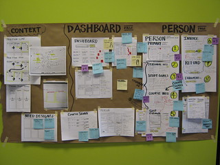
- Get out a big sheet of paper (2-3 meters) and stick it to the wall
- Use sticky notes to divide the sketchboard into broad topics like Design/User Personas or steps that your users will take (signup, log in, edit details, close account, etc).
- Use paper or the UX Sketchbook to start roughing out ideas or thoughts
- Stick them to the board (DS: preferably everything is sticky and can be moved around)
- Move things around
From: Sketchboard before you wireframe – Treehouse Blog
The process, detailed steps
See http://www.slideshare.net/ugleah/sketchboards-prototypes-presentation
and http://www.boxuk.com/blog/using-sketchboards-to-design-great-user-interfaces
1. Gather the inputs:
On the left side of the sheet (label it “Input” and optionally draw a dashed vertical line to separate it from the wireflows that sit on the right-side)
– sitemap
– scope items
– objectives
– add criteria (requirements/user stories) (
– users (personas, facts)
– success metrics
2. Sketch, sketch, sketch
Start sketching on separate papers
- Start with 6-up (A4 landscape) multi-page templates (a.k.a. thumbnail sketches) to explore one problem from different angles, or explore a possible flow (example) (template)
- – Focus first on quantity. Go right-brained. Your goal here is to come up with many different ideas or usability solutions without being too critical or pixel-perfect at this stage.
- – stick them up on the board
- – “take a step back and think about which one works best. Maybe [it’s a hybrid]. Do another thumbnail sketch if this is the case, then” go for the 1-up template.
- – don’t use pencils, just scribble it out to not get perfectionist over the details
Then sketch full pages using this single-page template (1-up) to “zoom in” on a particular thumbnail idea with slightly more detail
- – add headers, visual weight, functional elements
- – remain sketchy, don’t overdo it on the fine detail
3. Start your sketchboard
- Divide it into steps that your user will take or stages of user process (these should be labeled big)
– “Once you’re happy with the position and grouping of your sketches, replace the Post-It headings with inked ones – a big chisel tip Sharpie works well (just make sure the ink doesn’t bleed through the brown paper and onto the wall!) ”
- Roughly organise your problems and constraints
- Optionally add research findings, competitor examples and other inspiration libraries
- Select, evaluate, discuss, critique, decide – collaborate!
4. Share and iterate
– take it to your team in a tube
– take (seperate) notes for feedback (not on the board)
– go back and add summarized changes as annotations to your board
“During the evaluation sessions, annotate your sketches, use Post-It notes, and amend or create new sketches as required to capture feedback, suggestions and corrections”
5. Start wireframing
– THEN make the wireframes and/or prototype on the computer
Sketchboard examples


http://wireframes.linowski.ca/2009/05/sketchboarding/

http://blog.teamtreehouse.com/sketchboard-before-you-wireframe
UX flow examples
Resources
$ Tools
– Drafting dots (sticky)
– Mobile whiteboards (lightweight, useful if you lack wall space) or large piece of cardboard
Examples
https://www.flickr.com/photos/13513390@N05/albums/72157663384228863 Tip x403_error
http://pinterest.com/Webhode/user-experience/
Related articles
http://uxdesign.smashingmagazine.com/2012/01/04/stop-designing-pages-start-designing-flows/
http://conversionxl.com/how-to-design-user-flow/
See also:
Types of deliverables WP post
Learn more
http://konigi.com/book/sketch-book/work-fast TIP videos
More videos @ http://lanyrd.com/search/?q=sketchboard
http://www.usercentered.de/links/design-studio-und-sketchboards-materialsammlung/
Ideas, tools, alternatives
A.K.A. : Mindmap, wireflows, wiremaps, user flows, customer flow, user journey, concept maps, ux flow, ux flowchart, and sitemaps.
Prezi (ZUI) is a less linear, more free-form and animated way of telling a story. Alternatively, zoom in manually in powerpoint, or another way to easily navigate in a large canvas.
Story maps (hybrid between storyboard and UX map) @ https://nl.pinterest.com/pin/108438303505882523/
Swimlanes
UXpressia allows you to create digrams they call “Impact Maps”, starting with Personas. The fixed template allows you to add cards and connectors for the following stages: business goals > personas > impacts > deliverables > user stories
Collaborative design workshops
Philosophy
“For complex products, it’s helpful to understand the system at a high level, before anything gets fully designed, prototyped, or built. I like to call this method of flowcharting “wireflowing”. It’s a hybrid of traditional sitemaps, flowcharts, and wireframes. The benefit is that you can start to make UI-level decisions & establish consistent patterns quickly, while maintaining a relational understanding of how everything fits together.
Customer flows (journey maps): design principles
[Seperate post]
More tips in dashboard design and information design (info visualisation), design for simplicity, etc.
Do
The main focus should be a self-explanatory journey that can be easily shared.
- Show where it starts (usually upper-left corner)
- Provide focus, focal point (play with prominence)
- Split it off into separate posters (don’t cram it all on one page).
- Try a chronological left-to-right approach, showing the journey from start to end
- Landscape usually works better than portrait (for both screen and wall viewing)
- Use high-contrast colour of your arrow. What colour depends on the other colours present in your wireframes/mockups. (on B&W wireframes, blue or red arrows are often used.
- Consider adding a legend, not to far from the start screen but not left-aligned with it either.
- Be consistent where your arrow starts and ends. For example, ends in left and vertical middle of next screen (and touches it).
Don’t
- Avoid long arrows, too many arrows. Re-order the screens to fix this.
- Use too many colours. Be consistent with colours.
- Use too much text
http://www.uxmatters.com/mt/archives/2015/03/tools-for-mobile-ux-design-task-flows.php
Other delivery formats
Confined to Powerpoint? How to present your wireflows.
– Split it into two slides (con: you lose the overview)
– Spread your giant poster onto multiple and add transitions between them, like Prezzi. (con: requires desktop, downloaded version and instructing presenter)
– Compact all screens into a grid. If there is a split, give those screens a different background or a clear divide or different slide.
– Export as animation or video.
– Host the video (Vimeo, Sharepoint)
– Host the image map (Miro)
More
See my GetPocket (wireflows) + FB saves
UX journey mapping course @ Safari Books Online


 Posted by Dan