Principles and effects
– Opt-out works better than opt-in
> Make the default option the option that you want the user to take.
Read more: here and see Dan Ariely’s TED.com video about decisions.
– Adding unattractive options makes other options more attractive
> Goldilocks pricing effect (also here)
Limit choice
> 10 or more makes deciding harder. Maximum 7. Depends on content type.
> Limit the number of choices to 3 or 4
Related to: Goldilocks effect and abundance of choice affects decision making
– Order effect
> Show products from most to least expensive.
Read more: here
Social validation/proof
> Add testimonials and reviews, ratings (or tweets, likes, diggs)
> Reviews work better if users can relate to the reviewer (e.g. mention age, location or occupation)
> Expert opinions work well
Read more: here and Neuro Web Design book
Give the preferred option prominence
> Promote the product (e.g. on homepage)
> Highlight the product that needs promoting (using background color, font size, ‘popular’ stickers, 3D jump-out effect) to make it stick out when presented near others
Read more: Goldilocks effect
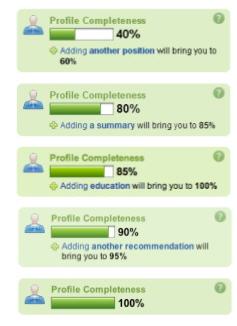
Progress bars
Your profile is x% complete. LinkedIn Profile completeness (empty space)
Commitment
I like to do what I say / said I was going to
Awards/levels/points/gamification
Feedback loop: e.g. instant gratification of seeing movie recommendations while you click movies you like
Unlocking/revealing/
> Covering your personal Skype profile photograph with an (annoying) ‘90% complete’ bar
Curiosity
Dashboards visualised where you can be: show empty slots/gray checkmarks , ( or shocking image?)
Empty slot example: Facebook “Your comment here” empty input field with your profile picture under every post.
Scarcity, time-limit
Visual imagery
Sex(y)
https://www.nngroup.com/articles/animation-usability/
Download/read this..for free!
Merchandising: support up-selling, cross-selling, and impulse buying.
> Provide ‘others liked’, ‘similar products’ on product detail pages
> Seduce at the right time
Read more: here (!) here , online impulse shopping
Examples: Amazon.com
Seduce but don’t deceive
> Create trust and confidence, demonstrate value, and guide the customer through the decision-making process
> Don’t push, over-manipulate
> Don’t be deceiving (see dark patterns)
>Avoid situations where users may feel cheated
Read more: here
To be continued..
How to implement in your project
How can we leverage {social proof} to get …. (goal) – http://getmentalnotes.com/
Great presentations
http://www.slideshare.net/stephenpa/the-art-science-of-seductive-interactions ++
General usability still counts!
People don’t read on the web, they scan
> Keep texts relevant, short and bulleted to increase the chance they will be read
Presentations
http://www.slideshare.net/stephenpa/the-art-science-of-seductive-interactions
Books
http://getmentalnotes.com/resources
Related
http://www.uie.com/articles/chak_interview/
Expert: http://www.schrijvenvoorinternet.nl/
Design for Conversion
GoodUI.org


 Posted by Dan